
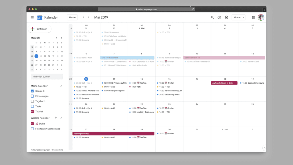
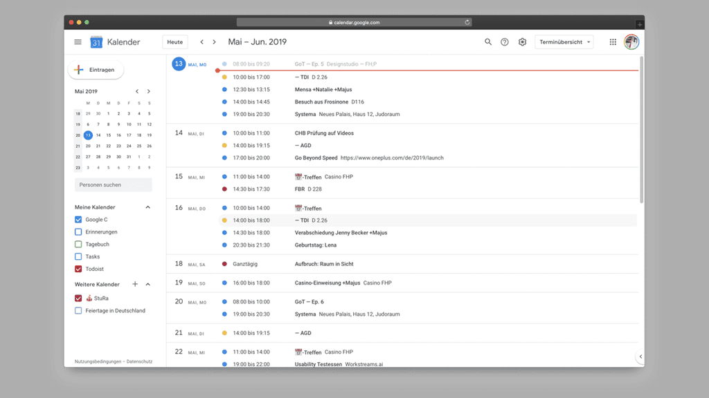
How can data visualizations become interfaces themselves? Which operators can be used to visually process datasets in an appealing way? The Google Calendar served as the basis, with its multitude of data from the past, present, and future providing an optimal foundation to represent connections between people, places, tasks, and more. In the current Google representation, these connections are either absent or remain hidden in the tabular visualization.
The first step was to break down the calendar into its individual components and to ask the question of what the future of a calendar might actually look like. It became clear that each view – whether month, week, day, or list – always resembles a static table. The current tool does provide links, but these only become visible after interacting with an event or when creating an event.


To pair the received operators with real data, a mind map was created using a month from Marius' calendar. The respective titles of the appointments, their times, the involved persons, and associated documents were mapped here. This visualization was the basis upon which we created the later screens.

It is striking that the individual appointments are also just a simple representation of different entities of a table. Currently, an entry in Google Calendar consists of seven entities:

To find out the necessary operators for our visualization, Marius recorded every interaction with the calendar for a month. The thesis was that by recording, we stumbled upon new interactions that we would otherwise have overlooked during daily use of the calendar. In the month of May, the calendar was accessed 45 times. New appointments were created in 37.7% of the cases, and the calendar was opened to check entered data in 28%. Marius used the calendar to change appointment times in 15% of the cases. The remaining 20% was split between deleting appointments, changing locations, and changing titles.
The result was indeed disappointing, but it made it clear that the engagement with the operators was too early at that point. Nevertheless, we had a foundation that helped us make conceptual decisions during the course of the visualization.

So we summarize the problem with current calendars: they may be able to clearly inform about upcoming appointments. However, what is really interesting are the additional connections that can be made between appointments. A daily schedule is functional, consisting of a title and time, but it does not offer effective identification of individual appointments, as Google only gives the user three options for differentiation - a freely selectable color, the position of the appointment, and a title based on up to 30 characters. We want to solve the problem of the ineffective calendar in connection with other Google services. For this purpose, information that remains in the dark in the described views should be brought to light, thus providing added value.
The representation of time and how time should elapse led to some of the most intense discussions, which is why we initially tested different concepts on paper. We agreed that there should be three consecutive areas. On the left, the past; in the middle, an actively designed area for the present; and on the right, a planning area for everything indeterminate in the future.


During the sketching process, two potential concepts emerged. In one, the entities fly freely around, ensuring that the interface is relaxed and elements can connect with each other across all times as needed. At the same time, we developed a stricter interface, in which a grid is used to display all events chronologically in the horizontal axis. The duration of an event does not matter in this version. Vertically, each event is divided into the seven entities, allowing for a simple comparison between the individual units. With the design, we were back to a table, which is why we initially distanced ourselves from this representation and pursued the freer approach first.


During the digital implementation, however, new rules had to be introduced to ensure a certain readability for the freely floating data. So-called streams divide all data into categories – in this case, studies, campus garden, private. Entities that belong together are further combined into units. However, the result at this time showed that this visualization produced too much redundant information, making connections not clearly recognizable.
To solve this problem, we neglected the typographic elements on both sides to focus on the center and thus on the present. Positively, it can be noted that the generated data cloud makes the 'now' area more visible and also identifies the important connections more elegantly. However, the separation of the entities has again lost some readability in the representation. It is not immediately clear which event is currently important with which parameters.


We felt like we were going in circles. After new sketched attempts made their way into the next digital implementation, we subsequently discarded them only to reintegrate them later because the new digital iterations didn't work after all and only created other problems. To escape this deadlock, we took our previously created drafts and broke them down into their components to get an overview of our elements. Subsequently, we related the results to our goal formulation.
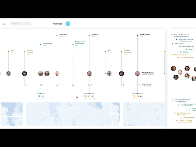
Through this gain of insight, we focused on developing a new form of presentation. In doing so, we came across one of the first wireframes, which appeared too grid-like, and combined it with the "Streams" iterations. Additionally, it was important for us to reduce the entities to be presented to a minimum. With the introduction of a map in the lower sector that represents the entire course of the day, each day even receives a slightly identifiable storyline. Certainly, the focus on the representation of networks is still lacking until this point, but with the last iteration, we have made an important step.
Getting the methods of HCID learned in the previous studies out of my head is not that easy - we struggled a lot to move away from User-Centered Design and to approach data visualization from iteration to iteration. A frequent discussion point was the unclear boundary between free data visualization and a useful calendar tool. A clear decision at the beginning would have allowed for a more precise process.